Overview
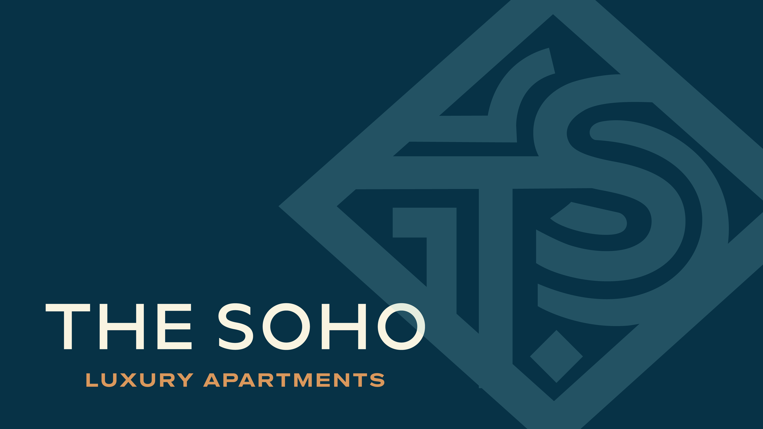
The Soho is a boutique apartment community inspired by the timeless architecture, creative culture, and industrial character of New York City's SoHo district. The goal was to create a brand identity that felt authentic to its namesake while appealing to a modern audience seeking a refined urban living experience.
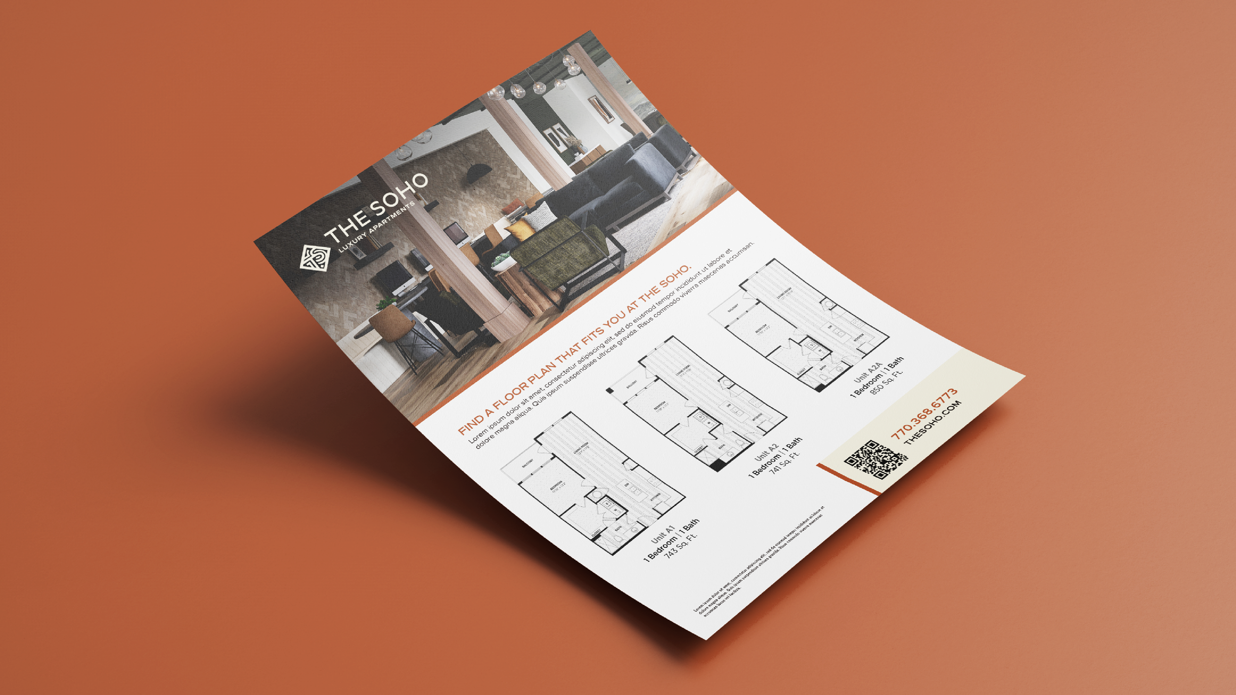
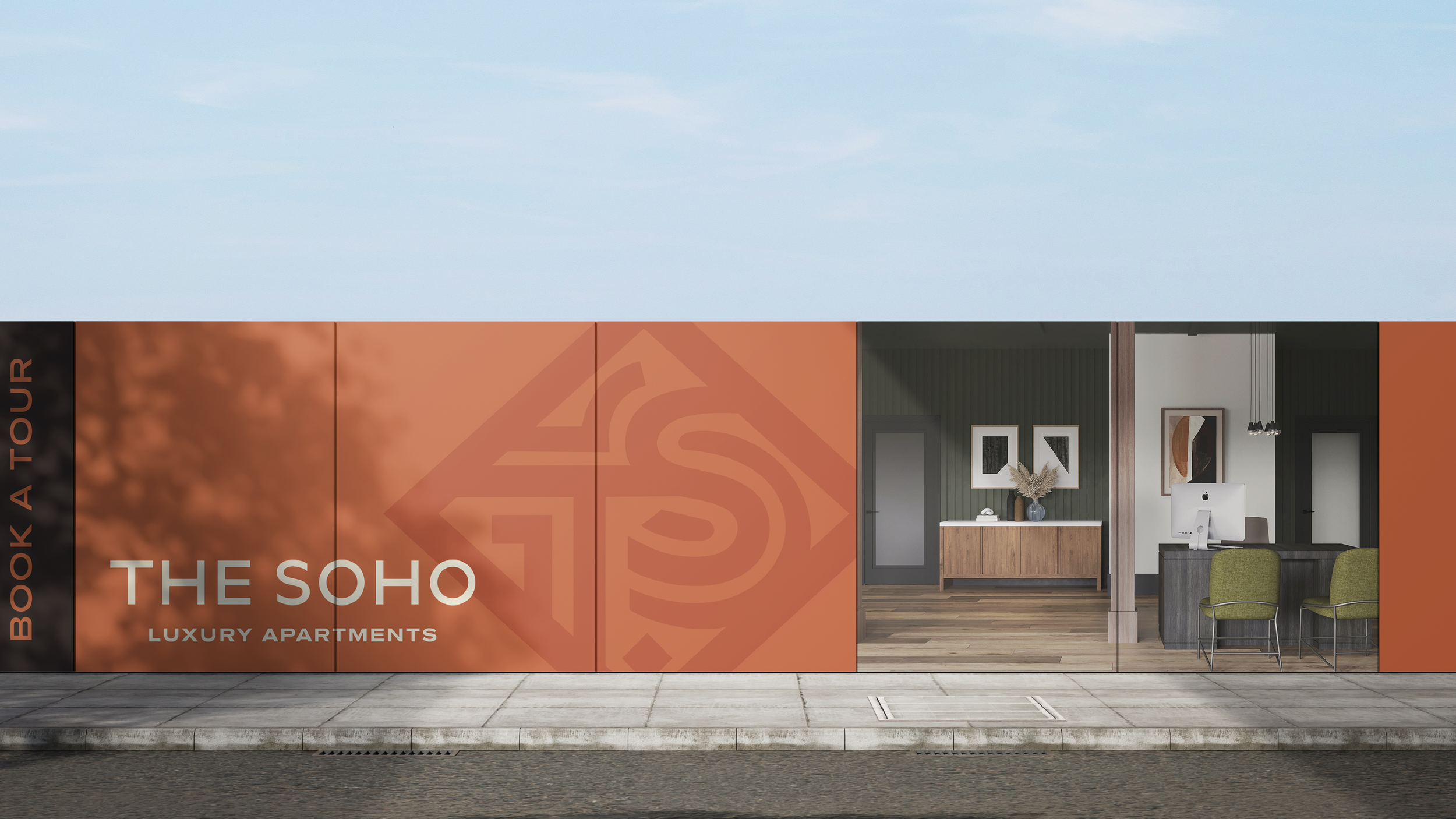
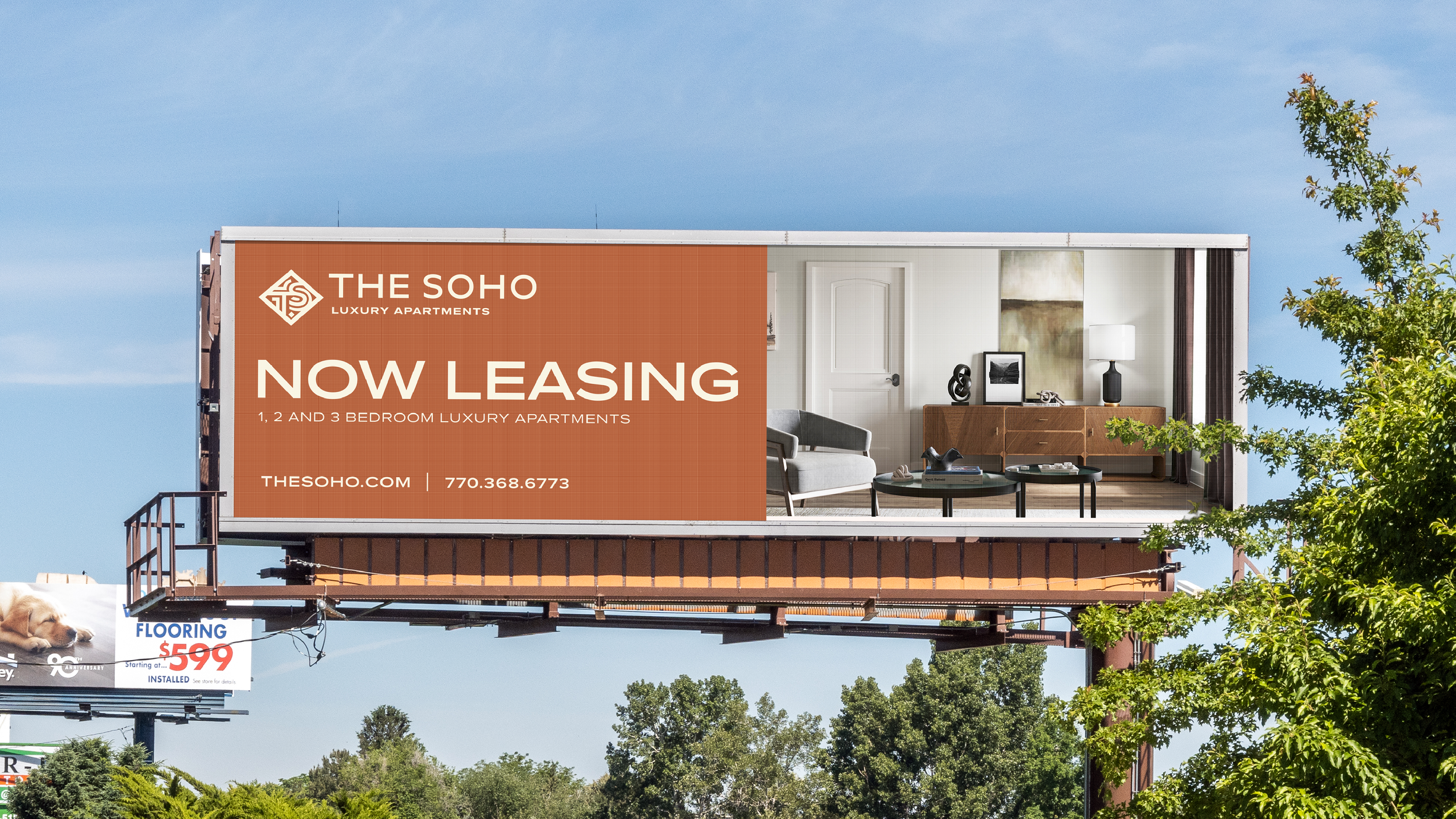
Working alongside Northstar Creative Co. on client collaboration, we developed a custom, hand-drawn identity and cohesive brand system rooted in research. Colors were sampled directly from SoHo buildings and streetscapes, creating a palette that reflected the neighborhood's brick, stone, cast iron, and historic textures. The result is a distinctive brand that feels both sophisticated and unmistakably connected to its inspiration.
-
Create a brand identity that captured the character of New York's SoHo district without relying on clichés or generic city imagery. The branding needed to feel handcrafted, elevated, and memorable while standing out in a competitive apartment market.
-
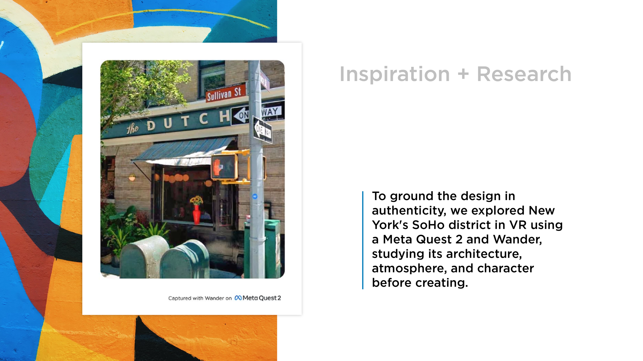
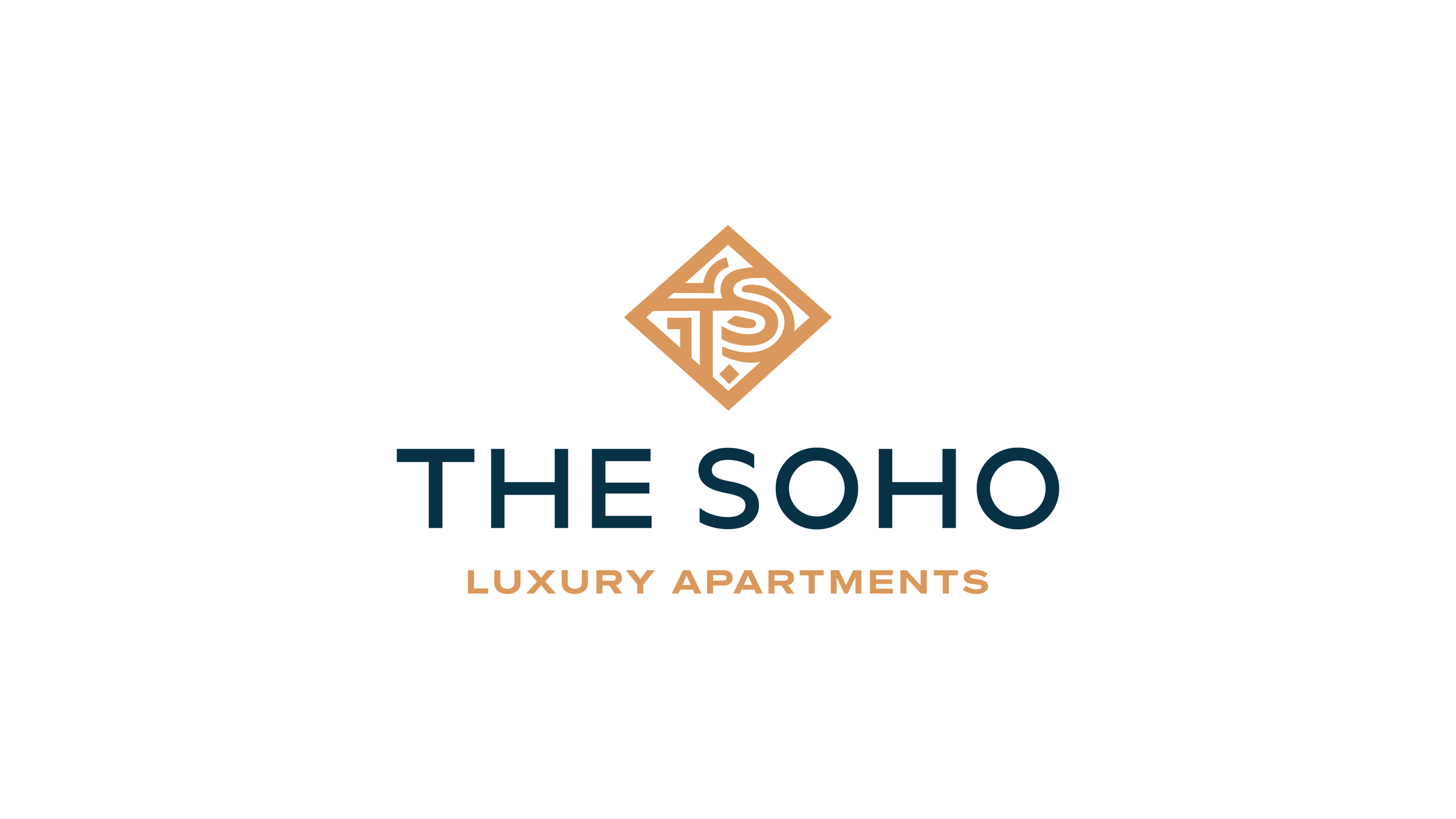
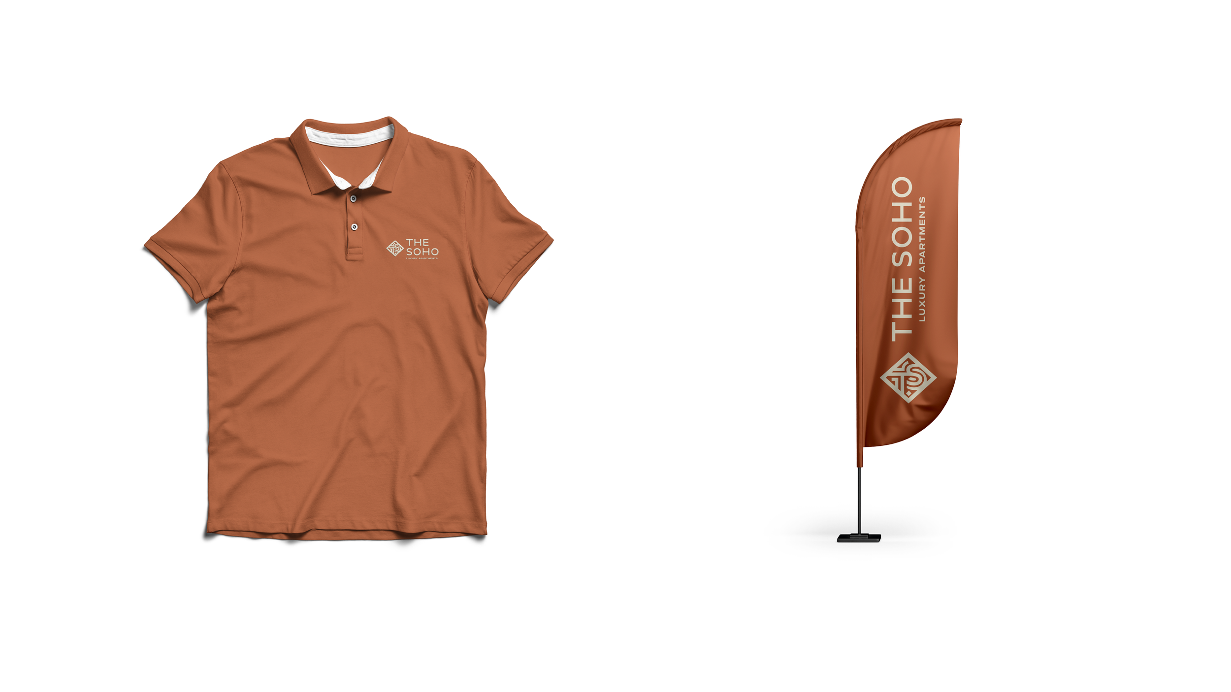
We designed a custom hand-drawn logo inspired by historic signage and architectural details found throughout SoHo. Through extensive visual research—including exploring the neighborhood in virtual reality—we built a color palette from the buildings themselves and developed a complete brand system that carries the same authentic character across every touchpoint.
-
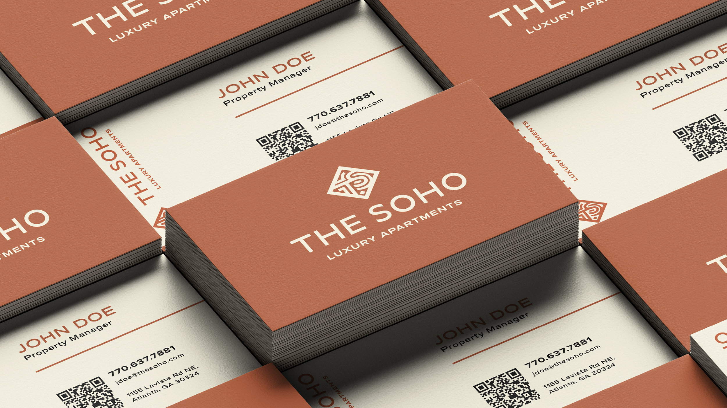
The new identity gives The Soho a memorable and cohesive presence that reflects the neighborhood which inspired it. Every element—from the logo to the color palette—works together to create an experience that feels authentic, distinctive, and built to stand apart in the marketplace.